Announcements Reimagined: From Fragmented Actions to a Manageable System
Overview, Role & Objectives
Announcements were a high-frequency communication feature in the product, but the experience was fragmented across creation, sending, and post-send management. Users often lacked confidence in selecting recipients, had no visibility into audience size before sending, and struggled to reliably find announcements after they were sent.
I led the redesign of the announcements experience end to end, owning the recipient selection flow, real-time audience visibility, and the introduction of a centralized Announcement Hub.
The goal of this work was to transform announcements from a set of disconnected actions into a more cohesive system that:
Increases confidence before sending
Reduces ambiguity in audience selection and reach
Improves flexibility in targeting recipients
Provides a reliable system of record for managing announcements over time
Together, this work focused on bringing clarity and structure to a critical workflow used daily by administrators.
The Problem
Through feedback and internal observations, several pain points emerged:
1. Recipient Selection Was Limiting & Confusing
Users could only send announcements to a narrow set of recipients. Workarounds (manual selection, repeated steps) were common.
2. No Visibility Into Audience Size
Users often didn’t know how many people would receive an announcement until after sending, leading to mistakes and anxiety.
3. Announcements Were Hard to Find Later
If a user sent an announcement outside their current context, it could seemingly “disappear.” There was no reliable history or management view.
User sentiment:
“Did this send to the right people?”
“Why can’t I see the announcement I just sent?”
“I don’t trust this flow.”
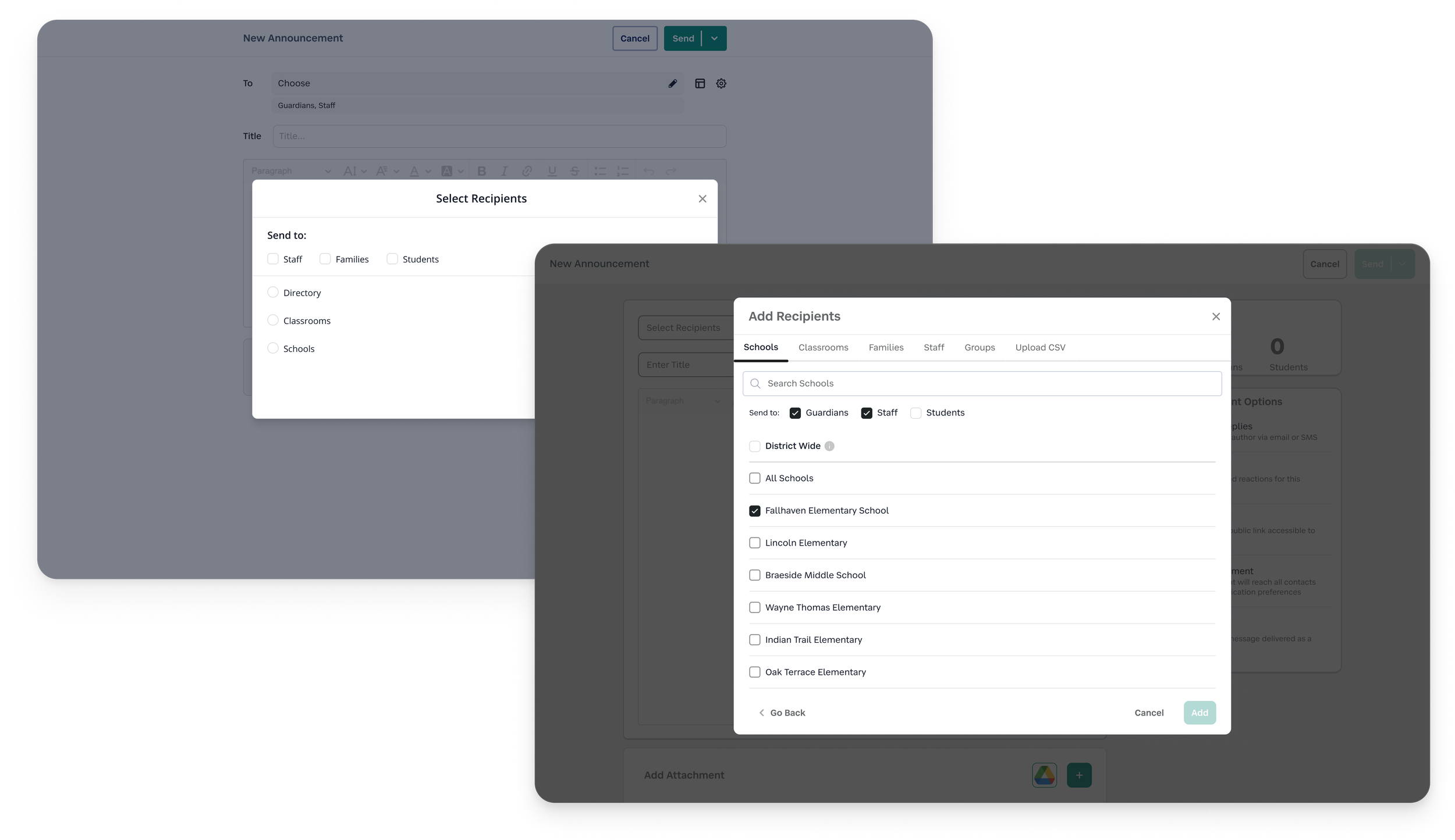
Section 1 – Expanding & Simplifying Recipient Selection
CHALLENGE
The original recipient selection experience was one of the biggest sources of friction in the announcements flow.
Users could only target a limited set of recipients, and selecting the right audience often required manual workarounds or repeated steps. More importantly, the system didn’t match how users actually think about their audiences.
Users weren’t thinking in a single dimension—they needed flexibility to target:
Specific individuals (or families)
Context-based groups (like classrooms)
Custom-defined collections
The existing design flattened these needs into a constrained, hard-to-navigate interface, leading to confusion, inefficiency, and low confidence in who would ultimately receive a message.
MY APPROACH
I started by auditing how recipient selection worked across different entry points and identifying where users hesitated, backtracked, or made errors.
One key insight emerged:
The problem wasn’t just limited functionality—it was a mismatch between the system’s structure and users’ mental models.
I explored a few directions:
A unified selection list combining all recipient types
Progressive filtering within a single view
Separate selection modes based on recipient type
While a unified model initially felt more streamlined, it quickly became overwhelming—users struggled to distinguish between fundamentally different entity types (people vs. groups).

DESIGN DECISIONS
I ultimately designed a multi-mode selection system, organized by clear recipient types:
People — individual users
Places — context-based groups (e.g., classrooms, schools)
Custom Groups — user-defined or uploaded collections
Key decisions included:
Separation over consolidation
Distinct tabs reduced cognitive load and made it easier for users to navigate large datasets without confusion.Consistent selection patterns across modes
While categories differed, interaction patterns remained predictable—minimizing the learning curve.Progressive disclosure of complexity
Users could focus on one type of recipient at a time, rather than parsing everything at once.
OUTCOME
This shift from a constrained, one-size-fits-all selector to a flexible, structured system led to:
Faster and more intuitive audience targeting
Reduced reliance on manual workarounds
Increased confidence that the right people were being selected
More importantly, it established a scalable foundation that could support more complex targeting needs over time—without increasing cognitive load.
Section 2 – Designing for Confidence with Recipient Visibility
CHALLENGE
One of the most consistent points of hesitation in the announcements flow occurred just before sending.
Users had no clear understanding of how many people would receive their message until after it was sent. This lack of visibility created a high-stakes moment filled with uncertainty:
“Is this going to 30 people or 300?”
“Did I accidentally include too many recipients?”
As a result, users either hesitated to send, double-checked excessively, or made mistakes they couldn’t easily undo.
This wasn’t just a missing data point—it was a breakdown in trust at a critical decision moment.
MY APPROACH
I focused on identifying where reassurance would have the most impact.
Through reviewing the flow, it became clear that confidence didn’t come from adding more information—it came from making the right information visible at the right time.
I explored a few directions:
Displaying recipient counts only after selection was complete
Providing a detailed breakdown of recipients by type
Introducing a real-time, lightweight count that updated as users made selections
Detailed breakdowns added clarity, but also introduced noise and slowed users down. What they needed most was a quick, reliable sense check before sending.
DESIGN DECISIONS
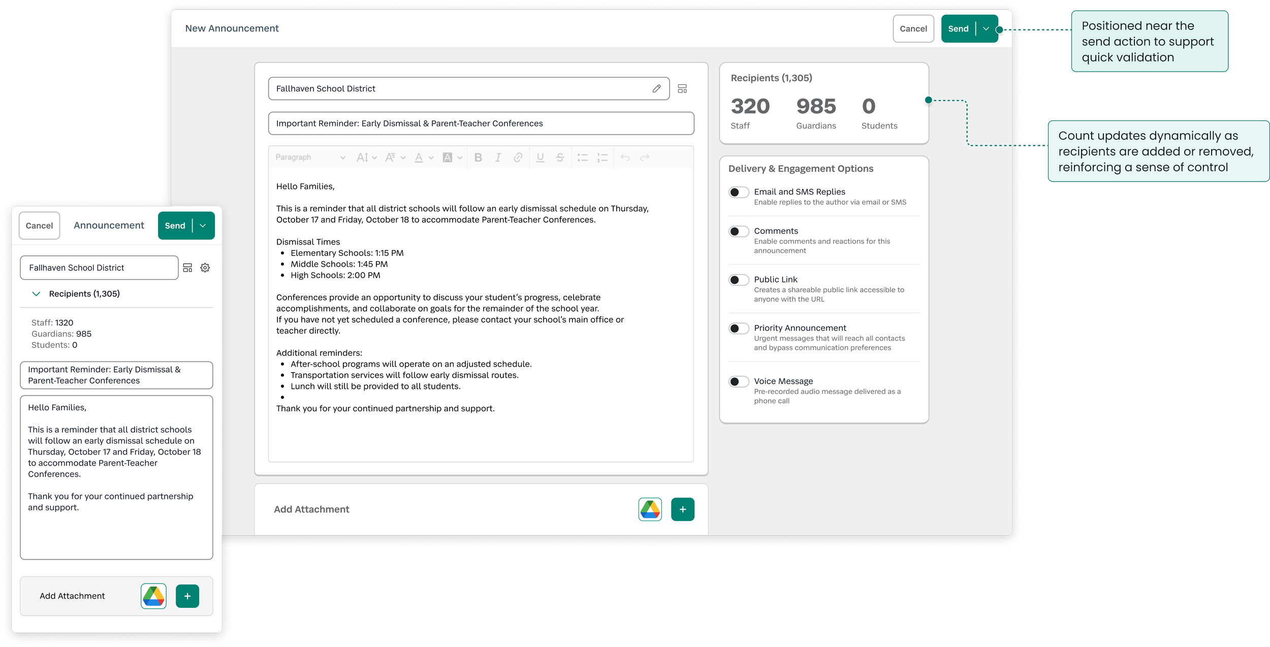
I introduced dynamic recipient counts directly within the creation flow, designed to support fast validation without adding friction.
Key decisions included:
Real-time feedback
The count updates instantly as users add or remove recipients, reinforcing a sense of control.Strategic placement near the send action
Positioning the count close to the primary action ensures it’s seen at the exact moment users need reassurance.Clarity over completeness
I prioritized a single, clear total over more detailed breakdowns to avoid cognitive overload in a high-focus moment.

WHY IT MATTERED
This small addition addressed a disproportionately large usability gap.
By making the impact of an action visible before it happens, the experience shifted from:
Guessing → Knowing
Hesitation → Confidence
Reactive correction → Proactive validation
OUTCOME
Users could quickly validate their audience before sending
Reduced likelihood of accidental over-communication
Increased confidence in the announcements workflow
In testing and feedback, this feature consistently stood out as a moment where the system felt more predictable, transparent, and trustworthy.
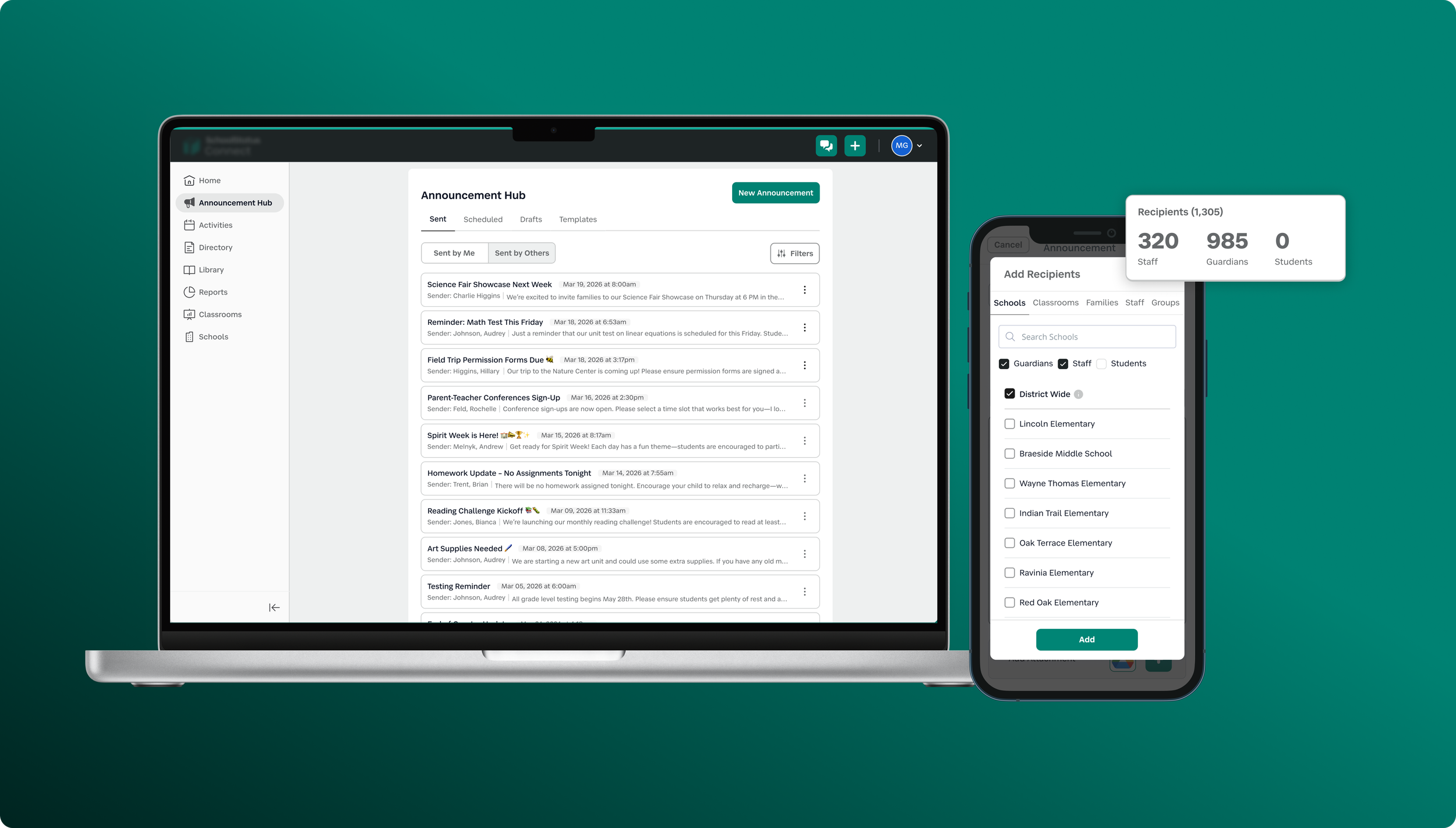
Section 3 – Creating a Centralized Announcement Hub
CHALLENGE
Even after successfully sending an announcement, the experience didn’t hold up.
Announcements were tightly tied to the context in which they were created (e.g., a specific class or school). Once sent, they were often difficult—or impossible—to find again unless users retraced their exact steps.
This led to a recurring set of issues:
Users couldn’t verify what had been sent
Drafts and scheduled messages were hard to track
There was no clear system of record for past communications
Over time, this eroded trust. From the user’s perspective, announcements didn’t feel persistent—they felt like they could simply disappear (even when that wasn’t the case).
MY APPROACH
I reframed the problem from a feature gap to a system gap:
Announcements weren’t lacking functionality—they were lacking a home.
I began by mapping the full lifecycle of an announcement:
Creation
Editing
Sending
Reviewing
Reusing
This revealed that while we supported individual actions, we weren’t supporting ongoing management.
I explored a few structural directions:
Keeping announcements embedded within existing contexts
Adding lightweight history views within each entry point
Creating a dedicated, centralized hub
While embedding history locally felt simpler, it reinforced the same fragmentation users were already struggling with. A centralized model offered a clearer mental model: one place to go, regardless of where an announcement originated.
DESIGN DECISIONS
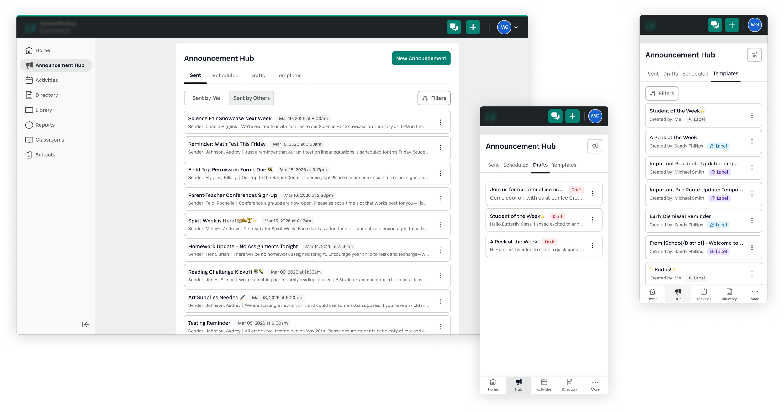
I designed a dedicated Announcement Hub to serve as the single source of truth for all announcement activity.
Key decisions included:
State-based organization
Announcements were grouped into clear categories:Sent
Drafts
Scheduled
Templates
This aligned with how users think about progress and made it easier to locate items quickly.
Familiar management patterns
I leaned on familiar table patterns users already understood (sorting, scanning, quick actions) to reduce the learning curve.Emphasis on findability and visibility
The hub was designed to answer key user questions at a glance:What has been sent?
When was it sent?
What’s pending?
Decoupling from creation context
Announcements could now be accessed independently of where they were created, reinforcing persistence and reliability and a one-stop shop to see all communications.
WHY IT MATTERED
This shifted announcements from a one-time action to a manageable system.
Instead of relying on memory or retracing steps, users now had:
A clear history of communication
Ongoing visibility into announcement states
A reliable place to manage and revisit content
This directly addressed one of the core trust issues in the experience—making announcements feel stable, trackable, reusable, and accountable.
OUTCOME
This shifted announcements from a one-time action to a manageable system.
Instead of relying on memory or retracing steps, users now had:
A clear history of communication
Ongoing visibility into announcement states
A reliable place to manage and revisit content
This directly addressed one of the core trust issues in the experience—making announcements feel stable, trackable, and accountable.
Results & Reflections
THE IMPACT
This work transformed announcements from a fragmented, low-trust feature into a cohesive, end-to-end system that supports users before, during, and after sending.
Across the experience, key improvements included:
More flexible audience targeting
Users can now select recipients in ways that match how they naturally think—reducing workarounds and friction.Greater confidence at the moment of sending
Real-time recipient counts introduced a clear validation step, helping users avoid mistakes and feel more in control.Centralized visibility and management
The Announcement Hub established a reliable source of truth, making it easy to track, revisit, and manage communications over time.
SIGNALS OF SUCCESS
While this project focused on foundational UX improvements, several signals indicated meaningful impact:
Reduced confusion around “who received what”
Fewer instances of users needing to resend or correct announcements
Positive feedback around increased clarity and predictability
Internal alignment around announcements as a system, not just a feature
These changes helped rebuild trust in a core workflow that users rely on daily.
WHAT I LEARNED
1. Small visibility changes can have outsized impact
Adding recipient counts was a relatively lightweight change, but it addressed a critical moment of uncertainty. Designing for confidence—not just functionality—can significantly improve the overall experience.
2. Structure drives usability more than surface-level UI
The biggest improvements didn’t come from visual polish, but from rethinking how the system was organized. Separating recipient types and centralizing announcement management both reduced cognitive load in meaningful ways.
3. Designing for the full lifecycle is essential
Initially, announcements were treated as a one-time action (create → send). Expanding the scope to include management (reviewing, editing, tracking) led to a more complete and trustworthy experience.
4. Mental models matter more than efficiency alone
Attempts to simplify (like combining all recipient types) actually increased confusion. Aligning the system with how users think—even if it introduces more structure—led to better outcomes.
LOOKING AHEAD
Given more time, I would explore:
Expanding the Announcement Hub into an organizational insight layer
Investigating how the hub could evolve from a management tool into an oversight system, giving district and school administrators visibility into communication patterns and how information flows across staff.Deeper insights into announcement performance
(e.g., open rates, engagement signals) to further support communication effectivenessSmarter recipient recommendations
Helping users choose the right audience based on past behavior